 |
Here are some design ideas for using SureThing CD/DVD Labeler
Deluxe. To read more about a particular topic, click one of the links below:
Touching up photos with SureThing
Deluxe
I've been having a lot of fun with the Touchup and Effects feature in SureThing
Deluxe v4. Despite being just plain fun to play with, this feature can save you
time, effort, and money. With this dialog we've pretty much eliminated the need
for any kind of 3rd party image editing software, and saved you the trouble of
having to edit/save/re-insert images for your labels and inserts. Here's some
examples of how this feature has helped me:
Tip 1: Creating color variations for CD or DVD sets
My MP3 backup fits on five DVDs. This left me with the task of printing five
DVD inserts and five labels. Since they are a set, I wanted them to look very
similar, but still be able to find an individual volume of the collection very
quickly. Touchup & Effects to the rescue! I found a basic background, inserted
it on my design and created four duplicates. I imported the corresponding playlist
for each of the five labels. (A-G, H-J, K-M, N-R, and S-Z, sorted by band name.)
Right now, all my labels are an orange-tan color, but I can easily change this
by going to Backgrounds>Touchup and Effects. The dialog defaults to the Effects
section and the "Colorize" effect:
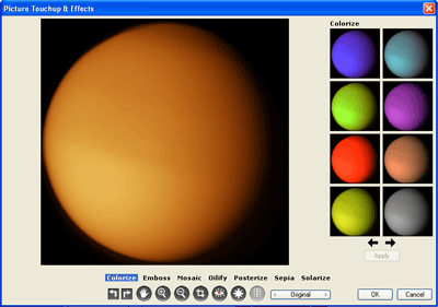
This is exactly what I want. The original image is orange-tan, so I'll choose
blue for the 2nd label, green for the 3rd, red for the 4th, and purple for the
5th. I'll use File>Transfer Design for the DVD Insert, and repeat the procedure.
Now I've made five matched labels and inserts with very little effort.
Note: The orange-tan image is actually a photo of Titan, Saturn's
largest moon. Due to their round shape, photos of planets, moons and other celestial
bodies make ideal images for CD and DVD backgrounds. Thanks to our tax dollars,
most of these images are freely available from NASA and other public institutions.
An interesting place to start, with a large collection of public domain images
from space is the HubbleSite.org.
Tip 2: Solving the dreaded unreadable text problem
Sometimes I'll have a very cool looking background image, but the text is just
not readable. Here's where a quick brightness and contrast adjustment can come
in handy. Take a look at the back insert below:
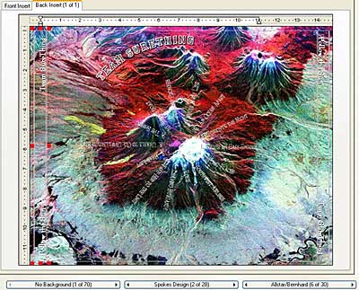
As you can see, the track list is pretty much unreadable. A quick adjustment
in Touchup and Effects is necessary. I go to Backgrounds>Touchup and Effects
and click on the Touchup button:

I lower the contrast and reduce the brightness and I end up with a very readable
back panel:
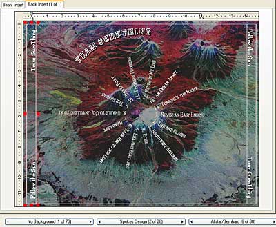
Touchup and Effects to the rescue again!
Tip 3: Fixing your own photos
If you use a lot of your own photos for your labels/inserts, you'll find some
really nice features for enhancing them. Here's a picture from my last vacation:
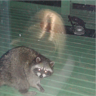
There are a number of problems with this image. One, it was taken through a glass
window, and two it's a cheap polaroid. What I want, is a fairly good picture
of this racoon. I'll use the Touchup and Effects dialog to crop the image and
then automatically adjust the exposure so we can get a clear view of the little
critter. I go to Backgrounds>Touchup and Effects and click on the Crop icon:

This allows me to click and drag to select which parts of the picture I want
to keep:
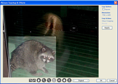
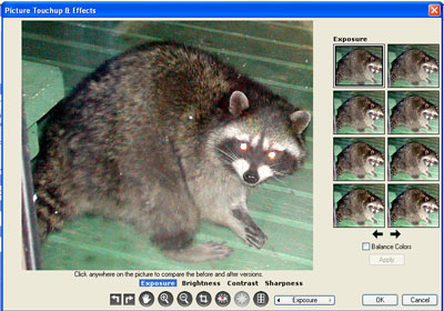
I click "Apply" and then select the Touchup button again. I click "Exposure" and
select an exposure level on the right. Now I can see the details of the racoon's
fur much better:
I'm probably one of the worst photographers on the face of the planet, but despite
this I've been able to salvage something for the front cover of my photo collection
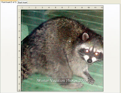
(BTW, if you ever find yourself taking pictures through a window or glass door,
it's best to cover your head and camera with a towel or blanket.)
What a difference! Even if you are a pretty accomplished photographer, you will
find that the auto exposure adjustment in Touchup and Effects will bring out
more details and create a more defined image for printing at high resolutions.
Here's an extreme example of just how cool this feature is:
One photo, that Sean had taken at night, seemed to be a complete loss... until
I ran it through a quick exposure adjustment. Take a look at the before and after:
Sometimes an image which you thought wouldn't work for printing at all, just
needs a little tweaking. I've often found myself creating entirely new images
from very bland, basic pictures. Beyond being a huge time-saver Touchup & Effects
is just plain fun to play around with. I never know just what I'll end up with!
|
|

