 |


 |
Today I'll be taking you through the process of creating a design from scratch
using two advanced design techinques unique to SureThing CD Labeler. We'll
be making a complete design for my latest Freeburnguide
CD compilation, "Freeburn Metal Vol.1." We'll use pie shapes for
the CD label and a table for a nice layout on the back panel insert.
You may have already tried the arch setting to create multi-line curves,
but here we will be using a background shade to create some pie shapes.
Begin with a blank SureThing
Full-Faced CD Label template.
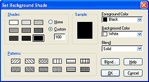
Set the background color to black by going to Backgrounds>Set Background
Color. Select the darkest square for a 100% shade, and click OK. The Foreground
Color pulldown should already set to Black. Ignore the Background Color
pulldown. It is only used when a "Blend" is set.
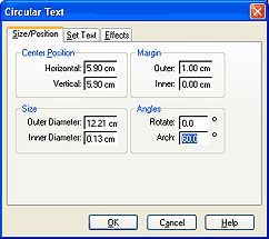
Go to Text>Add Circular Effect. Select the Size/Position tab and set
the Arch field to 60 degrees, the'Rotate field to 0, the Inner Diameter
field to 0.13 cm, and the Outer margin setting to 1 cm.
Now select the Effects tab and click the Set Background Shade button. Select
the darkest square again for the 100% shade, and set the Foreground Color
pulldown to Yellow.
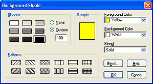
Click OK, and uncheck the "Draw borders and shades in full circle"
checkbox. This will restrain the background shade to the Arch setting of
60 degrees. Now select the Set Text tab to type in your text. I've selected
the "Title" playlist field by clicking the Set Field button. Click
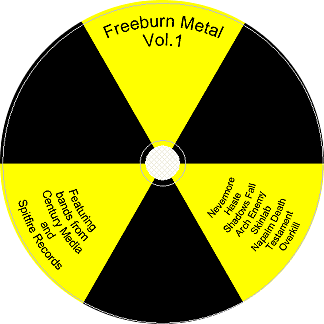
OK. We now have one of the three shapes we'll need to create a radioactive
symbol. A quick copy (Ctrl-C) and paste (Ctrl-V) creates the other 2 shapes.
Double-click on each circular text object and set the Rotation field in
the Size/Position tab to 120 and 240, respectively. Adding some final font,
size and text adjustments we end up with a basic radio-active symbol label.
We can now transfer all these objects to the jewel case. Go to File>Transfer
Design and choose CD Jewel Case Front Panel, as the New Label Type. Then
choose the SureThing
Front and Back Inserts stock. Click OK, and you should have your front
panel already designed to match the CD Label. (Use Ctrl-A and a little nudging
with the arrow keys if necessary.) Select the Back Insert tab.
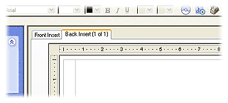
The back panel is where the table feature really shines. It is by far the
best way to layout your content when you are displaying multiple track fields.
I want to show the track number, track title, track artist, and each track's
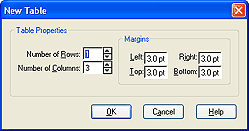
playtime. To begin go to Tools>Table>Insert Table. Click and drag
out a rectangle. This brings up the New Table dialog. Set the Number of
Rows field to 1 and the Number of Columns field to 3.
Then go to Playlists>Insert Playlist Field. The cursor should already
be in the first column. If it is not, then place it there by clicking in
the column. Double-click on the "#" sign to insert the track number,
type a period and a space and then double-click on the Track:Title field.
This inserts both playlist fields into the first column. Now click on the
second column to place the cursor there. You do not have to close the Insert
Field dialog. This is a non-modal dialog and will stay open while you position
your cursor. Now double-click on the "Track:Artist" field. Place
the cursor in the third column and double-click on the "Track:Playtime"
field. You are now done inserting fields. Click the Close button to close
the Insert Field dialog.
Now apply your playlist by going to Playlists>Playlist Manager. You will
now see your playlist on the design. The default table settings are set
for maximum spacing. These settings work well for small playlists, but my
16 track playlist will need a smaller row height. Place your cursor somewhere
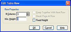
in the table and go to Tools>Table>Select Table. Now right-click on
the table and select Table>Edit Rows. Change the Min. Height field to
0.
Click OK, and set your font size to something smaller than 12pt. Now we
can make adjustments to the horizontal spacing by dragging the vertical
dividers. Double-click in the table to switch to I-beam mode. Then click
and drag the vertical column dividers. This is a very quick and easy way
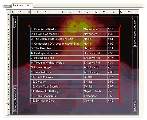
to format your content. Throw in a background, (I've used "Science
007" from the SureThing CD Photo collection), make some spine text
and we have our design.
These techniques are the shiz-nit, yo.
— Pete
|
|