 |


Pete's Tips & Techniques: Back Panel Solutions!
One of the trickiest CD labeling tasks is creating an attractive and readable
back panel insert. It's often difficult to read the track listing against a
busy background image. Below I will show you some techniques I've developed
for dealing with this issue:
Back Panel Tips |
 |
TIP 1 |
Adjusting the Size, Position and Brightness |
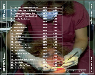
The track list above is very hard to read. This is where
the background properties dialog comes in handy. Go to Backgrounds>Background
Properties. 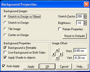
I decided that all I really needed to get my comical point across was
the mouth and the dental tools, so I raised the "Stretch Factor"
to 200%, nudged the image up to where only the hands, tools and head were
showing. Besides making a more concise joke, this decreased the amount
of colors and light/dark changes I had to deal with. I lowered the brightness
so that the white text would stand out more. When adjusting brightness,
remember your monitor is generally going to look darker than the printed
output. I ended up with this:

You can see there's still some light text on lighter portions of the
background, but when you print it, it will look pretty good. The text
is pure white, where the image, (since we darkened it), no longer
has an absolute white point. The subtle shades of white will become more
pronounced when printed. |
 |
TIP 2 |
Creating Drop Shadows |
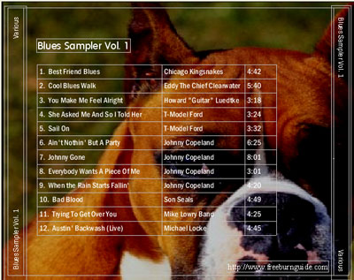
For the above back panel, I adjusted the background position
and brightness, but I still have trouble reading the track listing. A
drop shadow will help as it adds a bit of depth and contrast to
the text.
First, select the tracks table or text frame while in Object Mode.
Press Ctrl-C to copy the object to the clipboard, and then press
Ctrl-V to paste it. Now there are two track lists with the new
copy still selected. Select "black" from the color pulldown.
This track list will become the shadow:
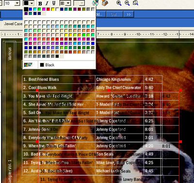
Now drag it into place on top of the original track list, but just a
tad lower and to the right. Go to Tools>Send to Back to send
it behind the original track listing. Use the arrow keys, (a.k.a. "nudge
keys"), to do the final positioning, and you'll end up with a surprisingly
readable track list:
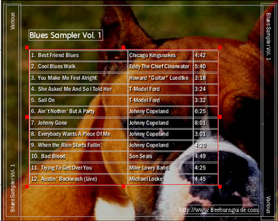 (It
may not look all that readable here as these images are optimized, but
trust me, it works very well.) |
TIP 3 |
Using a Text Frame Shade |
Sometimes you will not be able to solve your problems with
either of the first two techniques. Consider the design below:
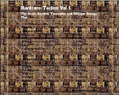 I
wanted a very complicated and chaotic image for this CD, so I shrunk an
image of an old circuit board (also from the SureThing CD), and tiled
it using the background properties dialog. It won't matter whether we
use light, dark or drop-shadowed text here, none of these options will
make the text readable. The background is just too busy. We'll want to
use "shades." Switch to Object Mode and double-click
on the title's text frame. This opens the Text Frame dialog:
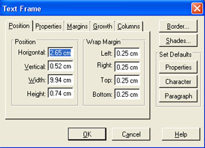
Click on the "Shades" button. This opens the Shades
dialog:
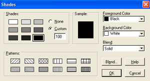 Since
the text in this particular text frame is white, select black for the
Foreground Color, and click the darkest shade box (this means 100% black
shade). Click OK and you'll see the back of the text frame is now black:
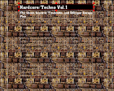 What
a difference a shade makes! Repeat this for each text frame along with
the spines. Use a dark shade for light text and a light shade for dark
text. You can create shades for tables as well, but I've used a rectangle
object as a shade for all the center objects. This way the white area
covers the track list, title, and artist text frames. To do this, go to
Tools>Object Tools>Rectangle Tool. Click and drag out a box,
and then double-click on it. Set the Line Style to "None" and
then click the "Shades" button. Set the shade to 100% white
and click OK. Then select the rectangle and go to Tools>Send to
Back.
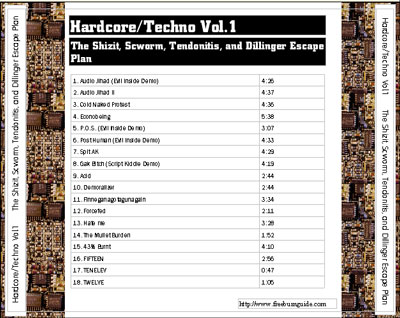 That's
it. Now you can read the track list even against the most complicated
background image! |
|